The best way to get visitors to do what you want them to do on your website is to create an effective call to action button.
A call to action button is simply a button people click on that says something like:
- Sign up now
- Call us today
- Get a free quote
- Download our brochure
- Read more
A good call to action button has several characteristics. Here are a few:
1. Color contrast
The color of the button should stand out from the surrounding elements on your website. So if you have a white background, don’t have a light button. Make it a dark color.

2. Give a few details
Some users want to know a little more information before they click on something. Keep it brief, but give them a few more details if it fits on your button and looks good.
If you’ll look at our buttons on the right, you’ll notice that we have the call to action statement in bold type, followed by a short explanation.
3. Don’t make it scary
There are some terms that people seem to shy away from. If a web user thinks they’re making a long term commitment that will be hard to get out of they’re less likely to click it.
Don’t say: “Register” or “Sign up”
Instead, say: “Receive Updates” or “Stay Connected”
These friendly terms are more inviting and people are more likely to click on it.
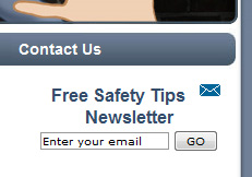
Defy the Bad Guy uses the phrase “Free Safety Tips Newsletter” rather than something like “Sign up to receive our newsletter”. After all, who doesn’t want to be safe? And who doesn’t like free?
4. Keep distractions to a minimum
It’s very easy to make a website too cluttered. But by adding a lot of stuff, we end up losing the effectiveness of what we started with.
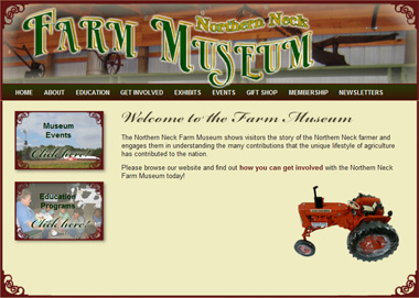
Sometimes less is more. The Northern Neck Farm Museum keeps their home page very simple to emphasize the buttons on the left to make sure that the important items are easy to see and there are no unnecessary distractions.
5. Use white space
White space, as mentioned in our article on How to Make Your Web Content Look Amazing is the blank or empty space surrounding elements on your web page. White space can really make your call to action button stand out and get noticed.

6. Put it at the top of the page
The “above the fold” principle is what the user sees on their screen without scrolling down. If feasible, put your important call to action buttons “above the fold”.
A lot of times it’s not practical to put your call to actions at the top. Maybe it’s not how you want your website styled, or you have something else at the top that you want to highlight. That’s OK…this is just one way to do it.
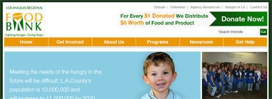
The Los Angeles Regional Food Bank uses two techniques for their call to action button – positioning it at the top of the page, and high contrast. They have a dark green button on a white background.
7. Give more than just one option
We always want people to “Buy Now” but what if they’re not ready? They don’t want to “Buy Now”, but they do want to “Learn More”. Give them the option to do that.
A cautious customer will take baby steps towards the ultimate goal. In baseball, a walk, stolen base and a base hit scores 1 run…same as a 450 foot home run. Let them go at their own pace.
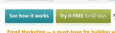
Constant Contact wants people to sign up for their free trial…but maybe people just want to “See how it works”.
8. Give the button a “hover” feature
Users like it when a button lights up when they hover the mouse over it. Our buttons on the right do this as well…they turn a slightly brighter yellow. It’s just an attractive, simple way to let your users know that it is in fact a button that you can click on.
Creating a good call to action button can really help you reach your website goals. We hope you can incorporate these ideas into your website and improve the effectiveness of your online presence!